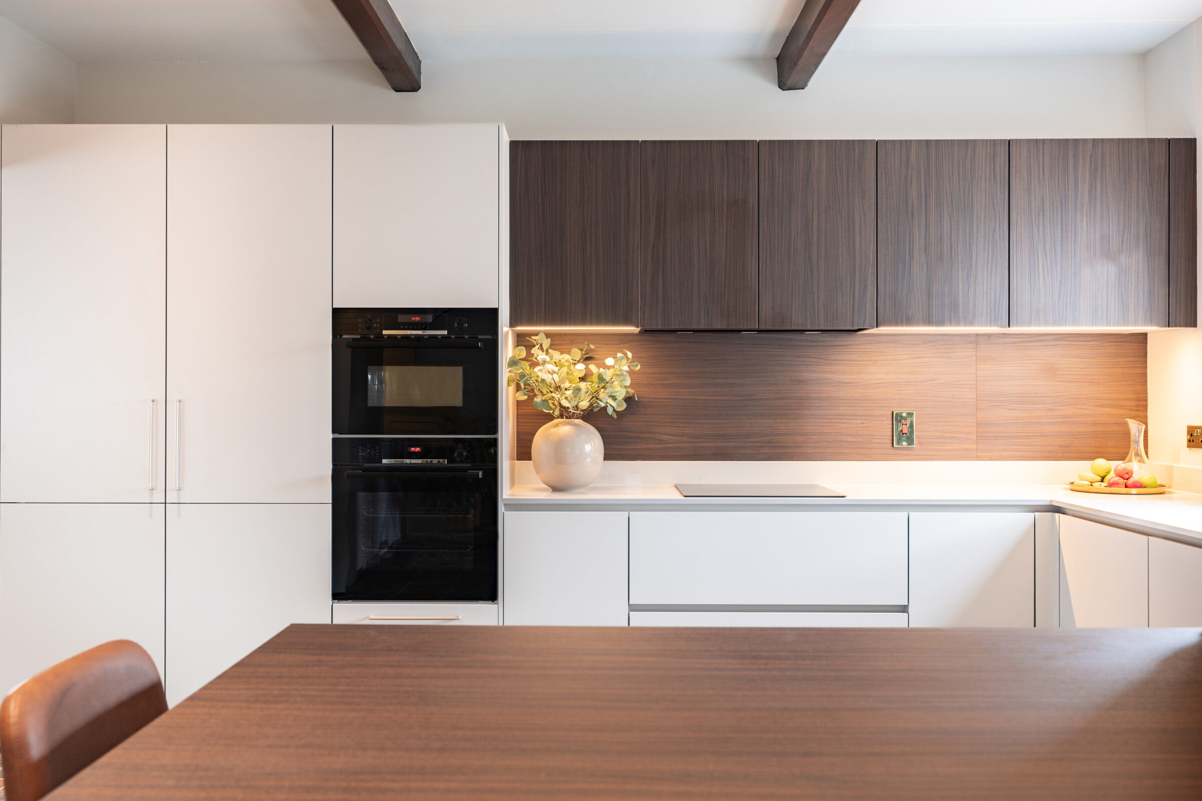
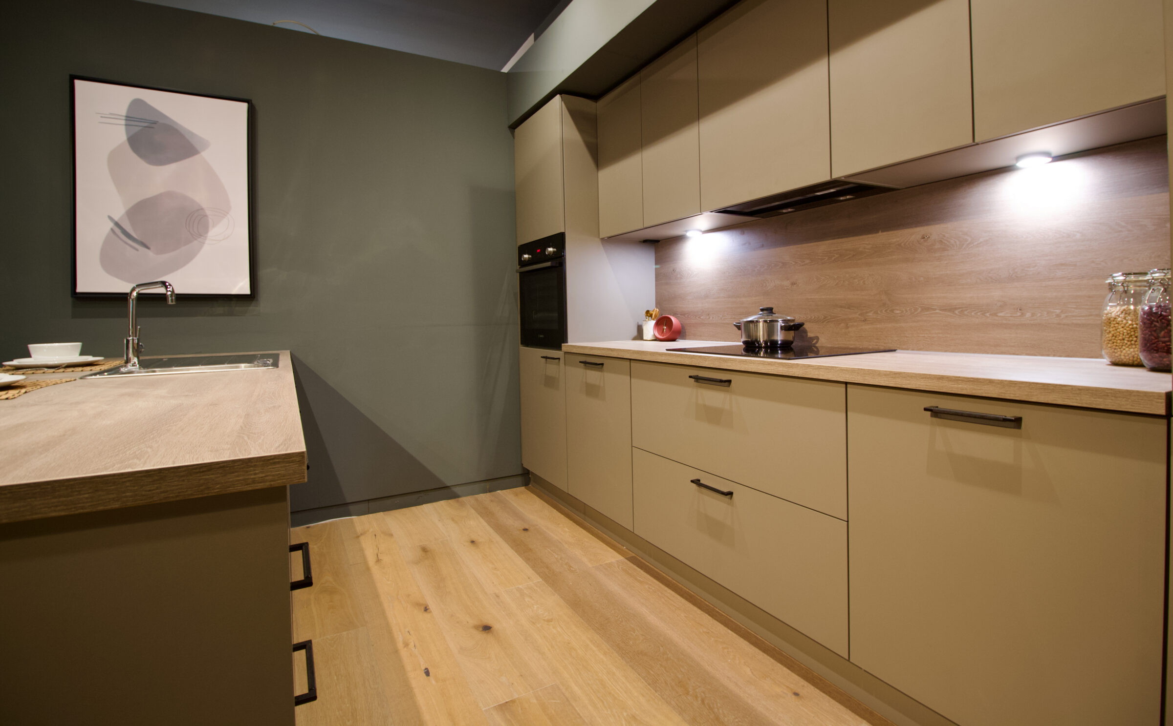
Kitchen colour is warming up. If you are gathering kitchen design ideas for a new project, the clearest shift is away from stark white and cool grey towards grounded, earthy palettes that feel lived-in rather than showroom-perfect. Below, we unpack the shades, materials and finishes shaping 2027, and how to use them so your kitchen still feels right long after the trend cycle moves on.
Key Takeaways
- Warmer palettes are replacing stark white and cool grey, with rich earthy paint colours and layered tonal schemes leading the way.
- Natural warmth comes from natural materials, especially walnut, oak and dark wood stains paired with soft neutrals.
- Neutral kitchens are anything but plain: taupe, cashmere, mushroom, olive and chocolate brown act as sophisticated backdrops for deeper accents.
- Kitchens increasingly look like lived-in rooms, with furniture-like pieces and colour wrapped across cabinets, walls and even ceilings.
- These shades are chosen for longevity, so a kitchen planned now will still feel current well beyond 2027.
2027 Kitchen Colour Trends at a Glance
Kitchen colour trends for 2027 centre on warm, grounded palettes, natural materials and hues that are rich but genuinely liveable. Expect to see:
- Warm taupes and mushroom tones
- Chocolate and tobacco browns
- Olive and moss greens
- Deep, dusty blues
- Aubergine and berry accents
- Light, chalky neutrals
Pure white and cool grey are firmly in retreat, replaced by colours with visible warmth and depth. Colour is also being coordinated with flooring, worktops and hardware rather than chosen in isolation. Encouragingly, many of these looks can be achieved with paint alone, which makes future updates simple.
From Cool to Warm: The New Neutrals
“Neutral” now means warm, layered tones rather than flat white or blue-grey. The key shades are mushroom, clay, almond beige, caramel, mocha, warm taupe and soft greige with a brown undertone. They pair beautifully with natural wood, stone and dark wood floors, creating an envelope of natural warmth.
Use them generously on main cabinetry, walls and even ceilings, where a single calm tone makes a room feel cocooning. There is a practical benefit too: warm neutrals disguise everyday marks far better than brilliant white, making them a sensible choice for busy family kitchens.
Dark Wood and Natural Wood: The New Backbone of Colour
Wood finishes are central to 2027 kitchen trends, shaping how colour reads in the room. Walnut, dark-stained oak, truffle black oak, sand oak and mid-tone honey oaks are all in demand. Dark wood cabinetry or a timber island anchors a warm, tonal palette and makes softer paint colours feel richer by contrast.
A two-tone scheme is one of the easiest ways in: dark wood on the island or tall units, with painted fronts around the perimeter. Look for visible grain, relief pore effects and matt finishes, which emphasise the tactile quality of natural materials. To see how timber and colour work together in real homes, browse our =black, white and dark kitchen projects.
Earth-Inspired Palettes: Browns, Ochres and Tobacco Tones
Brown has become one of the leading colour families in the kitchen. Chocolate, cognac, tobacco, ochre, camel, caramel and muted terracotta all feature, used on base cabinets, islands, wall panelling, plaster or limewash walls and even stone-look worktops.
These tones come alive alongside natural stone, brass, patinated metals and dark wood, building depth layer by layer. The key is balance: pair strong browns with lighter worktops or splashbacks so the room feels enveloping rather than heavy. Limewash and plaster finishes are particularly effective here, because their subtle variation in tone gives brown a softness that flat paint cannot match.
Greens for 2027: From Sage to Softer Olive
Sage green has had a long run, and it is now evolving into deeper, more complex greens. Soft sage and moss suit relaxed, neutral kitchens, while night green, olive and yellow-green make bolder statements.
Try green on lower cabinets with neutral uppers, a fully colour-washed larder, or a single furniture-like dresser. Olive and mossy greens are particularly good at connecting a kitchen to the garden, especially alongside natural wood and stone. If you are collecting kitchen design ideas for a garden-facing extension, green is a natural place to start. Because green undertones can shift from khaki to vivid depending on the light, test samples at different times of day before committing.
Rich Accent Colours: Aubergine, Berry and Dusty Blue
The boldest kitchens favour rich accents used thoughtfully rather than all-over brights. Aubergine and plum, merlot and burgundy, deep maroon, burnt orange and dusty blue are the key families. Place them on an island, a tall larder, scullery doors, a banquette or inside glass-fronted cabinets.
Grounded with natural materials, jewel-toned purples and berry shades behave almost like sophisticated neutrals. Unexpected pairings such as dusty blue with maroon, or maroon with ochre, are on trend too; keep them balanced by letting one shade lead while the other plays a supporting role. Deep, saturated shades like these are also among the colours that make a kitchen look expensive.
Light and Airy, But Not Stark
Light kitchens remain popular, but they now use soft off-whites and chalky tones rather than stark gallery white. Warm off-white, chalk, sand, pale clay, cashmere and pale almond beige are the shades to know.
Layer neighbouring tones on walls, cabinets and trims to add quiet dimension, and introduce natural wood accents, veined stone and brass or nickel hardware so the scheme never feels flat. These palettes are especially useful in compact spaces and mini-kitchens, where maximising light matters most. In Ireland, where daylight is often soft and grey, a warm off-white will usually feel far more inviting than a cool, blue-based white.
Tonal Layering: One Palette, Many Depths
Rather than relying on one statement colour, many of the most interesting kitchens use tonal layering: several shades from the same family across cabinets, worktops and flooring. Think light taupe, mid tobacco and deep chocolate working together.
Greens, browns and blues are especially effective, creating schemes that feel calm yet complex. Brown might step from pale timber to mid-tone cabinetry and deep stone, while green might move from sage to olive with night-green accents. A tonal palette also makes it easy to add furniture-like pieces and artwork without visual clutter.
Texture, Finish and Light: How They Change Colour
Surface and lighting can transform how any paint colour or material appears. Matt lacquer, smart glass, relief woodgrain, ceramic fronts, metal and stone veneer all affect colour depth. Matt and honed finishes soften strong hues, while subtle gloss and mother-of-pearl effects add luminosity to neutrals.
Lighting matters just as much. Warm LEDs, adjustable white systems and concealed strips all change the way colour reads after dark. Plan colour and lighting together from the start, and view samples in both daylight and evening light. North-facing kitchens benefit from shades with yellow or red undertones, while south-facing rooms can comfortably carry cooler, deeper tones.
Integrating Colour With Overall Kitchen Design
Colour decisions work best when made alongside layout, storage and appliance planning. Align paint colours with worktops, splashbacks and hardware, whether brass, nickel or blackened steel, for a coherent scheme. In multi-zone kitchens, complementary shades can define a coffee nook, scullery, banquette or secondary workstation.
Furniture-like larders, dressers and freestanding islands can carry deeper or contrasting colours without overwhelming the room. As a rule, keep the base palette timeless and save more experimental shades for elements that are easy to repaint or replace. If you would like expert help bringing it all together, a kitchen design consultation is the ideal place to compare colours, materials and layouts side by side.
Kitchen Colour Ideas for Different Styles and Homes
The same 2027 colour trend can look very different in a city flat, a period house or a contemporary open-plan space. Classic homes suit deeper greens, aubergine, maroon and dark wood, paired with warm neutrals and traditional profiles. Modern interiors come alive with olive, dusty blue, caramel and chalky off-whites, combined with slim shaker or flat fronts and metal details.
In small kitchens, choose a lighter palette with one dark wood or rich accent element so the room never feels smaller. Whatever your architecture, focusing on natural materials and warm undertones lets you interpret 2027 kitchen colour trends in a way that feels personal and enduring.
Frequently Asked Questions
Are white kitchens completely out of style in 2027?
Bright, stark white is no longer the leading look, but soft, warm off-whites and chalky shades are still very current. To refresh an existing white kitchen, try warmer wall paint, dark wood accents and brass or nickel hardware rather than replacing everything.
Which 2027 kitchen colours will date the least?
Warm taupes, mushroom, cashmere, olive green, deep blue and natural wood finishes are the safest long-term choices. Keep permanent elements such as cabinets and worktops in these grounded tones, and use bolder hues where they are easy to change.
Can I use dark colours in a small kitchen without making it feel cramped?
Yes. Dark wood and deep paint colours work in small spaces when balanced with light worktops, good lighting and minimal clutter. Concentrate the darkest tones on base units or a single feature piece, and keep upper areas lighter.
How do I choose paint colours that work with existing flooring and worktops?
Start with samples of your fixed elements, such as the floor, worktop and tiles, and test several paint swatches directly against them. Lean into the warm or cool undertones already present rather than fighting them with opposing hues.
Is it worth following 2027 colour trends if I plan to sell my home soon?
Warm neutrals, natural wood and soft greens are generally buyer-friendly and add appeal without feeling risky. Avoid niche or extreme colours on large fixed surfaces, and keep bold statements to accents if resale is a priority.