What Is the 60 30 10 Rule for Kitchens? A Practical Guide to Colour Balance
Kube Interiors designs and installs luxury bespoke kitchens across Meath. Visit our Dublin showroom to start your project.
By Ruth McKenna
Kube Interiors designs and installs luxury bespoke kitchens across Meath. Visit our Dublin showroom to start your project.
The 60 30 10 rule is one of the simplest ways to keep a kitchen design feeling intentional rather than thrown together. Borrowed from general interior design, it gives you a clear formula for splitting colour across cabinets, surfaces, and accessories so nothing competes for attention. This guide breaks down how the rule works in a kitchen specifically, with real palette examples and the situations where it’s worth bending.
The 60 30 10 rule is an interior design colour formula that’s been adapted specifically for kitchens, where surfaces, cabinetry, and fittings all need to work together.
The rule itself is simple: 60% dominant colour, 30% secondary colour, and 10% accent colour. It’s worth stressing that this is about visual proportion rather than exact square footage measured with a tape measure.
In a kitchen, the “dominant colour” usually covers the biggest continuous surfaces, things like the perimeter cabinets, the walls, or the flooring.
The “secondary colour” adds contrast and depth on elements such as an island, a run of wall units, the worktops, or a feature backsplash.
The “accent colour” is the finishing touch, used sparingly on bar stools, pendant lights, handles, textiles, and small appliances.
A concrete example helps make this less abstract: 60% warm white shaker cabinets, 30% sage green on the island and backsplash, and 10% matte black hardware and stools.
The rule works with pretty much any style of kitchen, from Scandi minimal to colourful maximalist, because it’s based on balance rather than any specific colour scheme.
This section gives a simple, actionable process you can follow before ordering any cabinets or paint.
Start by choosing your dominant colour, the 60%, first. This is your main colour anchor, and it usually lives on the cabinets, the walls, or the flooring.
From there, assign your secondary colour, the 30%, to a smaller but still substantial area: the island, a run of tall units, the backsplash, or a contrasting worktop.
The accent colour, the 10%, is best reserved for movable, easy-to-swap items, things like bar stools, pulls, knobs, textiles, decor, and countertop accessories.
Sketching the layout, or using a digital mood board, to visually block out roughly 60/30/10 proportions before committing to purchases can save a lot of second-guessing later.
It helps to think about both colours and materials, paint, wood, stone, and metal, under the same 60 30 10 framework, rather than treating colour and material choices separately.
Finally, test real paint swatches and material samples together in your actual kitchen light at different times of day before making any final decisions. If you’d rather do this in person against full kitchen displays, our kitchen showrooms Dublin location lets you see cabinets, worktops, and accents already arranged in proportions like these.
The success of the 60 30 10 rule depends almost entirely on choosing a well-thought-out colour palette in the first place, rather than the maths itself.
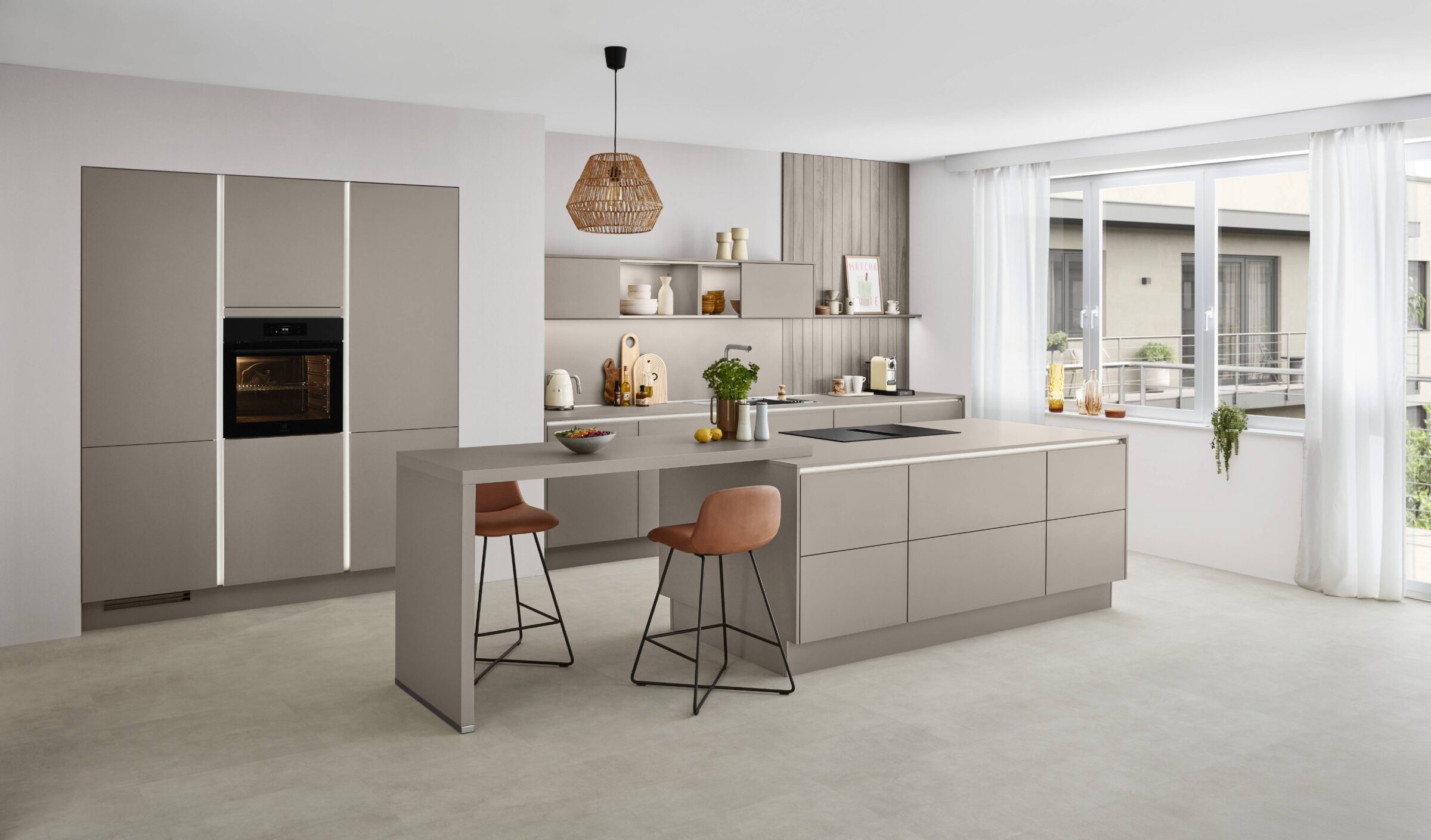
For the dominant colour (60%), look for versatile, timeless shades such as warm white, soft grey, greige, pale taupe, or light wood tones, since this colour has to work hardest across the most visible surfaces.
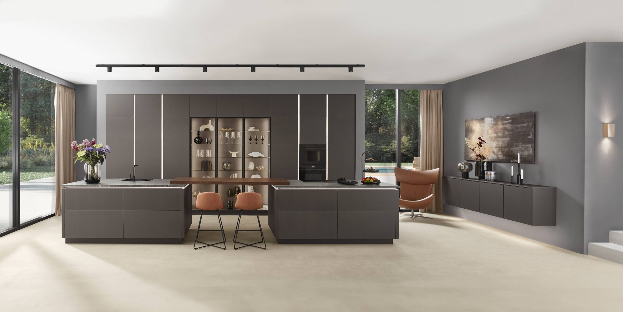
For the secondary colour (30%), choose something that complements the main colour, such as navy, charcoal, forest green, or a deeper wood tone, for an island or a tall cabinet run.
For the accent colour (10%), pick something that adds personality and contrast, such as mustard yellow, copper, terracotta, teal, or matte black.
It’s worth thinking about the overall mood you want, calm, bold, cosy, or airy, and choosing your dominant and secondary colours with that mood in mind rather than picking each colour in isolation.
Drawing inspiration from fixed elements you already have, an existing floor, window frames, or appliances, is a practical way to build a palette around decisions you can’t easily change.
Accent colours are the easiest to change over time, so they’re the natural place to experiment with trend-led shades without much risk.
The dominant colour sets the overall feeling of the room more than any other single decision in the kitchen.
It often appears on the perimeter cabinets, the walls, large sections of flooring, or even a full-height pantry wall. Flooring is one of the places this 60% most commonly shows up, especially in open-plan kitchens where the floor continues into a dining or living area. If you haven’t settled on a flooring material yet, our guide on what type of flooring is best for a kitchen covers the main options in more detail.
Calm, light tones, off-white, ivory, light grey, or pale beige, tend to work well as the dominant colour in smaller kitchens, helping the space feel open and spacious rather than closed in.
Bolder dominant choices, such as a deep olive or charcoal cabinetry, can work well too, but generally suit larger kitchens with good natural light rather than small, dim rooms.
Whatever you choose, the dominant colour should be the most forgiving backdrop for everyday life, and easy to pair with several different accent colours over time.
If you know you like to change your accent colours every few years, it’s worth keeping the dominant colour relatively neutral so future updates stay simple.
The secondary colour is what stops a kitchen from feeling flat and one-dimensional once the dominant colour is in place.
Typical locations for the secondary colour include the island cabinets, a run of wall units, backsplash tiles, or a contrasting worktop.
It generally works best as a richer or darker tone than the dominant colour, things like navy, graphite, bottle green, or a mid-tone timber.
Thinking in colour families helps here: 60% warm white with 30% mushroom taupe, or 60% pale sage with 30% deep olive, are both combinations that read as cohesive rather than mismatched.
A concrete example: pairing warm white perimeter cabinets with a deep navy island gives the island an obvious role as the room’s focal point, using the secondary colour deliberately rather than as an afterthought.
The secondary colour should always complement the dominant colour rather than compete with it, since the goal is harmony rather than two colours fighting for attention.
The accent colour is the small 10% that makes a kitchen design feel genuinely intentional and finished, rather than just functional.
Common accent locations include handles and pulls, tapware, bar stools, pendant lights, open-shelf decor, small appliances, textiles, and artwork.
It’s worth choosing accent colours that bring energy or sophistication, such as mustard yellow, brushed brass, copper, black, or a saturated blue or green.
Because accents are only 10% of the room, this is exactly where it’s safe to experiment with trends, including the recent popularity of warm metallics and earthy terracottas.
Repeating the same accent colour in three to five places around the room creates a cohesive, deliberate look rather than scattering it randomly.
Changing the accent colour later, swapping mustard for rust, for example, can refresh the whole kitchen without any major renovation work.
These specific, modern colour combinations are meant as starting points rather than rules to copy exactly.
A light, airy kitchen: 60% warm white cabinets and walls, 30% light oak on the island and shelves, and 10% black accents on hardware and lighting.
A bold, contemporary kitchen: 60% soft greige cabinets, 30% deep navy on the island and backsplash, and 10% brushed brass on handles, the tap, and pendants.
A nature-inspired kitchen: 60% sage green cabinetry, 30% warm oak flooring and worktops, and 10% terracotta textiles and decor pieces.
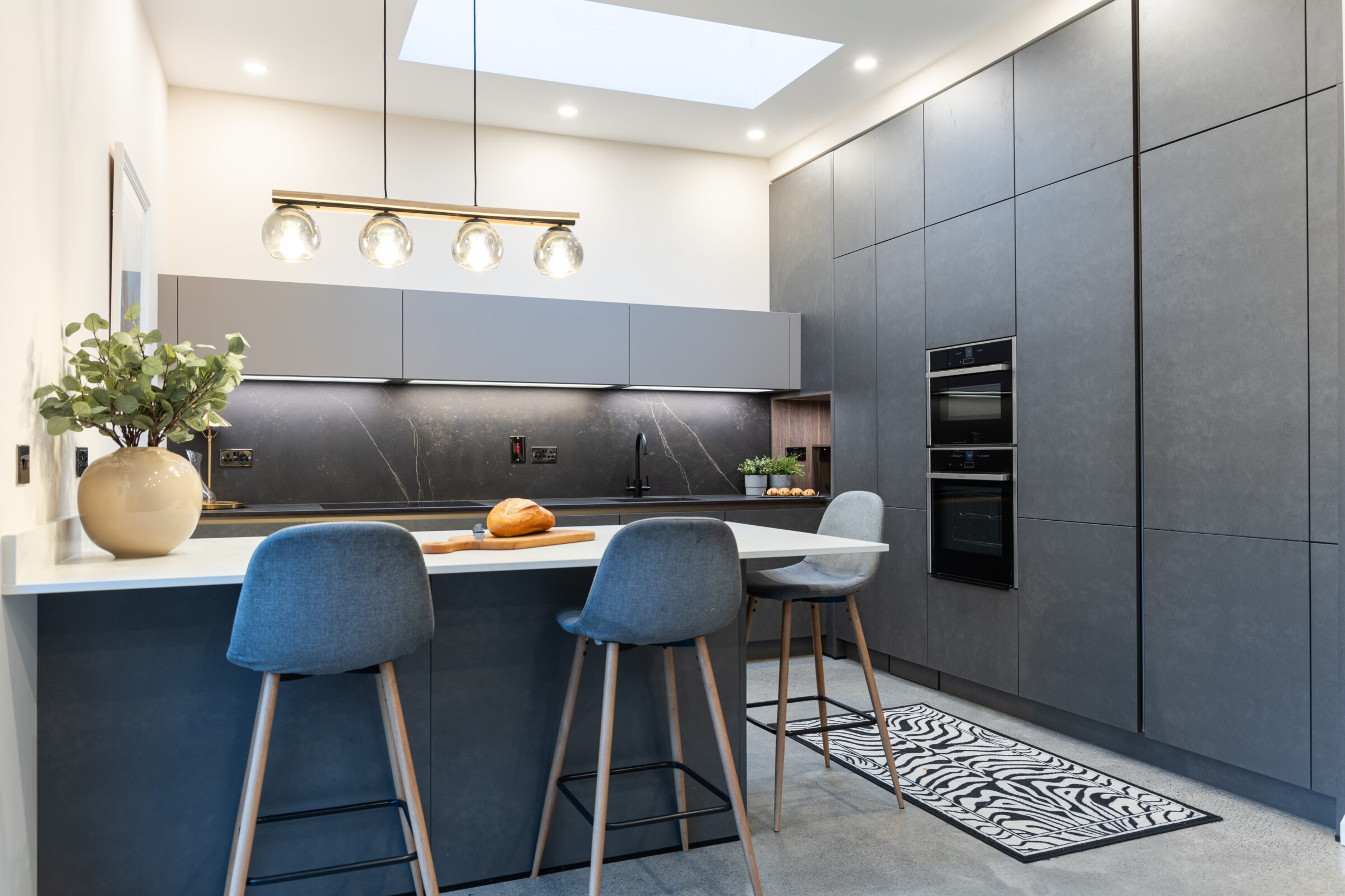
An urban modern kitchen: 60% matte charcoal cabinets, 30% concrete-look worktops and light grey walls, and 10% cobalt or mustard bar stools and accessories.
Adapting any of these starting points to your own layout, lighting, and existing finishes is generally more useful than trying to recreate one exactly.
Avoiding a handful of common pitfalls helps the rule work the way it’s meant to.
One frequent mistake is introducing too many competing colours beyond the main, secondary, and accent colours, which makes the kitchen feel busy rather than balanced.
Another is ignoring the rest of the home’s palette and ending up with a kitchen that clashes with the rooms around it.
It’s also easy to let the accent colour become too dominant, large bright-red appliances or several bold stools, for example, so it no longer reads as a true 10% accent.
Choosing colours only from a screen is a common trap; testing samples in both natural and artificial light, in the actual kitchen, gives a far more accurate picture.
Overlooking finishes and textures, gloss versus matte, wood grain, or metal sheen, also affects how the 60/30/10 balance is perceived, even when the colours themselves are correct.
Finally, it’s worth thinking about long-term maintenance: very dark or very glossy dominant colours tend to show fingerprints and everyday wear more easily than a quieter finish.
It’s worth remembering that the 60 30 10 rule is a guide for kitchen design, not a strict formula that has to be followed precisely.
In very small kitchens, the dominant colour might end up feeling more like 70% or 80% of the room, simply to keep the space bright and uncluttered.
Colour-maximalists can introduce two or three accent shades instead of one, as long as a single colour still visually reads as the main 10% accent overall.
Monochrome or tonal schemes might use several shades of the same colour, while still roughly following a 60/30/10 light-to-dark distribution rather than a strict three-colour split.
Confident rule-breaking makes sense when there’s a strong design vision behind it, such as an all-dark kitchen with only metallic accents standing in for the usual secondary and accent colours.
In the end, personal taste and everyday happiness in the space matter more than matching the exact percentages, so treat the rule as a starting point rather than a constraint.
No, precise measurement isn’t necessary; the 60 30 10 rule is about approximate visual balance rather than strict maths. It helps to stand back from the room and judge whether one colour clearly dominates, one clearly supports it, and one appears only as smaller accent pops.
Yes, natural materials such as oak flooring, walnut cabinets, stainless steel, or brass hardware all contribute to the overall colour palette in the same way paint does. It’s worth deciding upfront whether a major wood or metal finish belongs in the 60%, 30%, or 10% portion of the room, and planning the rest of the palette around that decision.
It generally works best to treat the open-plan area as one whole space, using a consistent dominant colour across both the kitchen and living zones rather than treating them separately. Repeating the same secondary and accent colours in both areas, bar stools in the kitchen and cushions in the living room, for example, helps the whole space feel cohesive rather than like two different rooms.
The rule covers all visible surfaces, including paint, cabinet finishes, worktops, tiles, flooring, metals, and textiles, not just painted walls. It helps to think in terms of the entire visual field in the room, rather than only the areas you’d technically paint.
Yes, and this is one of the real benefits of the 60 30 10 approach: the 10% accent is usually the easiest and least expensive part of the room to swap out. Bar stools, pendant shades, tea towels, small appliances, and decorative pieces can all be updated relatively cheaply to refresh the kitchen’s look without touching the cabinets or worktops.