There’s no strict rule for whether a kitchen floor should be lighter or darker than the cabinets, but in most kitchen design projects, designers lean toward contrast rather than a perfect match. Pairing a lighter floor with darker cabinets, or a darker floor with lighter cabinets, tends to create a sense of balance that a matching scheme rarely achieves. The right direction for your kitchen depends on your room’s light, its size, and which element you want to stand out.
Key Takeaways
- There’s no strict rule, but most designers favour a lighter floor with darker cabinets, or a darker floor with lighter cabinets, to create contrast and balance.
- Room size, natural light, and whether you want the cabinets or the floor to be the “star” are the three biggest factors in choosing lighter or darker.
- Matching the floor and cabinets in the exact same colour is usually a mistake; aim for at least two to three shades of difference, or a clear change in undertone or texture.
- Light floors are easier to live with day to day in many homes, hiding dust and pet hair, while dark floors hide spills and scuffs but show dust and crumbs more readily.
- A simple, repeatable process – check your natural light, decide what to highlight, pick a direction, then sample in your own kitchen – takes the guesswork out of the decision.
Should a Kitchen Floor Be Lighter or Darker Than the Cabinets?
There’s no single “right” choice here, but contrast between the flooring and the cabinets, whether the floor goes lighter or darker, almost always looks more intentional than choosing the same colour for both.
Cabinets are typically the dominant visual element in a kitchen, but the floor covers more continuous area than any other surface in the room, so the relationship between the two ends up controlling the whole mood of the space.
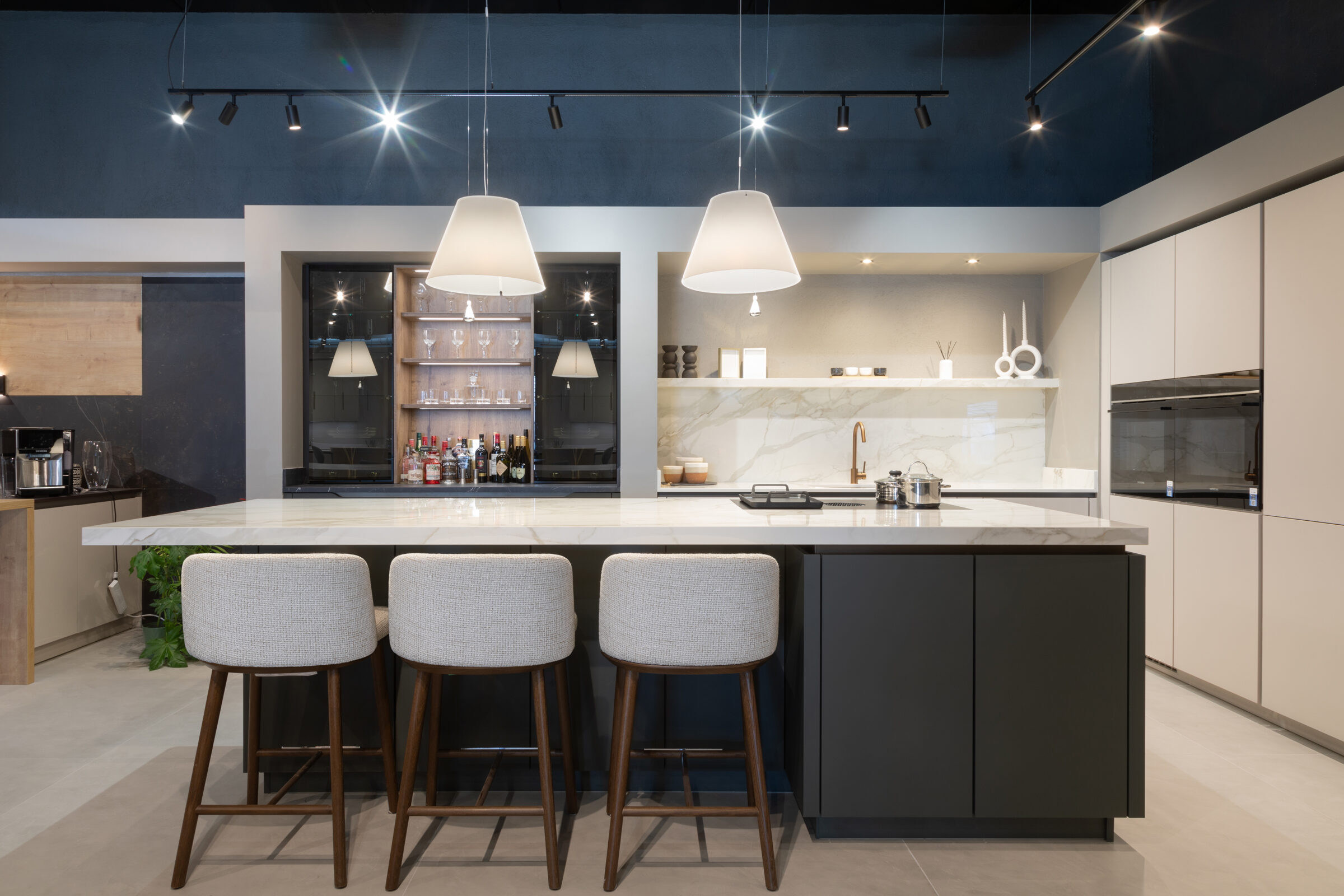
The general guideline most designers work from is straightforward: pair darker cabinets with a lighter floor, or lighter cabinets with a darker floor, unless you’re intentionally going for a moody, dark-on-dark look.
From there, the decision should factor in your room’s size (a small galley kitchen behaves very differently to a large open-plan space), the natural light it gets (north- versus south-facing, the number and size of windows), and how often the room is actually used.
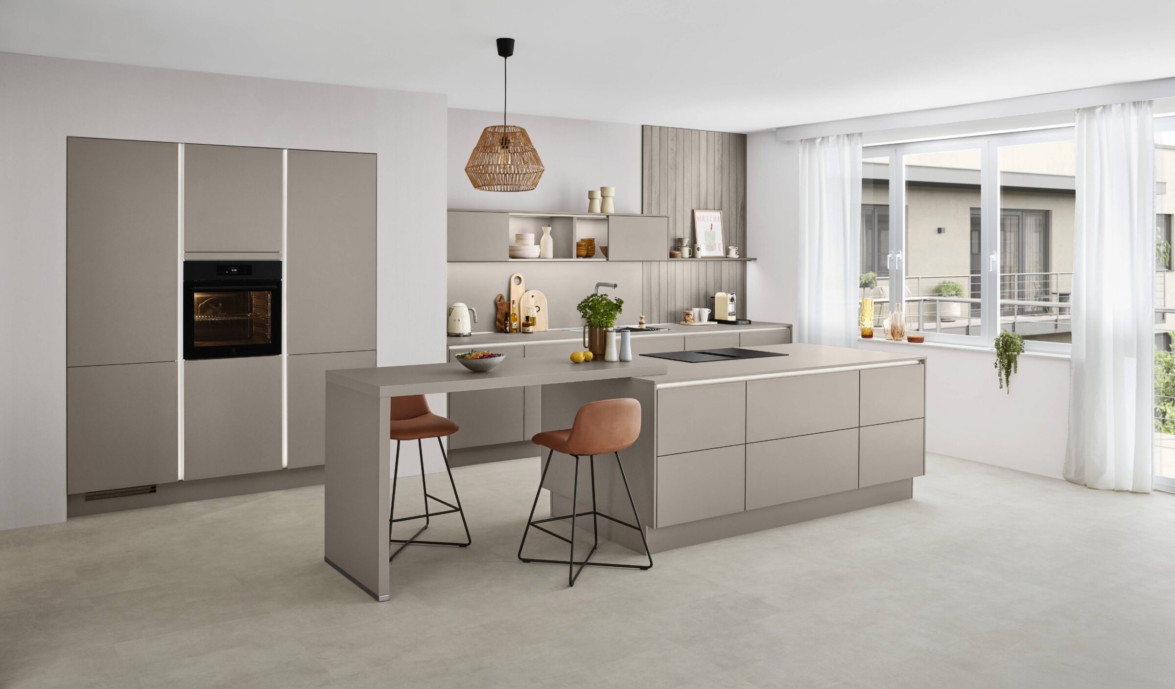
Heading into 2024 to 2026, popular kitchen floors such as light oak, warm greige luxury vinyl plank, and mid-tone stone have stayed popular largely because they work well with both darker cabinets and lighter cabinets, giving homeowners more flexibility if they update cabinet colour later.
How Natural Light and Room Size Affect Lighter or Darker Floors
Natural light and room proportions are usually the first things professional designers look at before recommending a lighter or darker floor, ahead of any colour preference.
In small kitchens with good natural light, for example a south-facing room around 10 by 12 feet with a large window, light floors paired with light cabinets can make the room feel noticeably airier and larger than it actually is.
In small, darker kitchens, the kind of north-facing layout common in city apartments, a very dark floor combined with dark cabinets can start to feel heavy and closed in. Lighter floors, or mid-tones paired with lighter cabinets, generally avoid that cave-like feeling.
In large kitchens, roughly over 200 square feet or open to a dining or living area, a darker floor with mid-tone or lighter cabinets can add warmth and stop the room from feeling empty or echoey.
It’s worth standing in your own kitchen at different times of day to see how much natural light actually reaches the floor and the cabinet fronts before settling on a direction.
When to Choose a Lighter Kitchen Floor Than Your Cabinets
As a rule of thumb, if you have darker cabinets, think navy, forest green, espresso, black, or dark walnut, a lighter or mid-tone floor usually feels more open and balanced than matching dark on dark.
A lighter floor, such as white oak, pale ash, or light greige tile, helps bounce natural light around the room and visually lifts cabinets that might otherwise feel heavy.
This direction works particularly well when you want the cabinets to be the main focal point, especially if they have an interesting colour, a shaker profile, or detailed door fronts worth showing off.
Light floors, whether pale wood, light stone, or soft grey porcelain, are also a practical choice because they tend to hide dust better than very dark floors, although spills can show more clearly against them.
A couple of concrete combinations to picture: dark navy shaker cabinets with a light oak herringbone floor, or charcoal base cabinets paired with warm beige large-format porcelain tiles.
When a Darker Floor Works Better Than Your Cabinets
A darker floor under lighter or mid-tone cabinets can ground a kitchen and make white or light grey cabinetry feel more substantial rather than washed out.
Dark floors, such as espresso hardwood, chocolate-stained oak, or charcoal concrete-effect tiles, add drama and depth, and tend to work especially well in large, well-lit kitchens with big windows or patio doors.
This combination works best when there’s enough natural light or strong artificial lighting in the room; without it, dark floors can absorb light and make the space feel smaller than it is.
Dark floors can visually hide some stains and everyday crumbs, but they tend to show dust, pet hair, and light-coloured scratches more readily than lighter floors do.
Pairings worth considering include white or light grey slab-front cabinets with a darker floor, or warm taupe cabinets with dark walnut planks.
Dark on Dark or Light on Light: High-Contrast vs Subtle Looks
Both dark-on-dark (dark cabinets with dark floors) and light-on-light (light cabinets with light floors) are valid styles, but each creates a very different vibe and comes with its own design challenges.
Dark-on-dark creates a moody, cocooning effect, think black or very dark green cabinets with dark smoked oak or charcoal tile floors, and tends to benefit from lighter countertops and warm metal hardware to stop the room feeling oppressive.
This combination can feel cramped in a small or poorly lit kitchen, so it’s generally a better fit for larger spaces with strong natural light or several layers of artificial lighting.
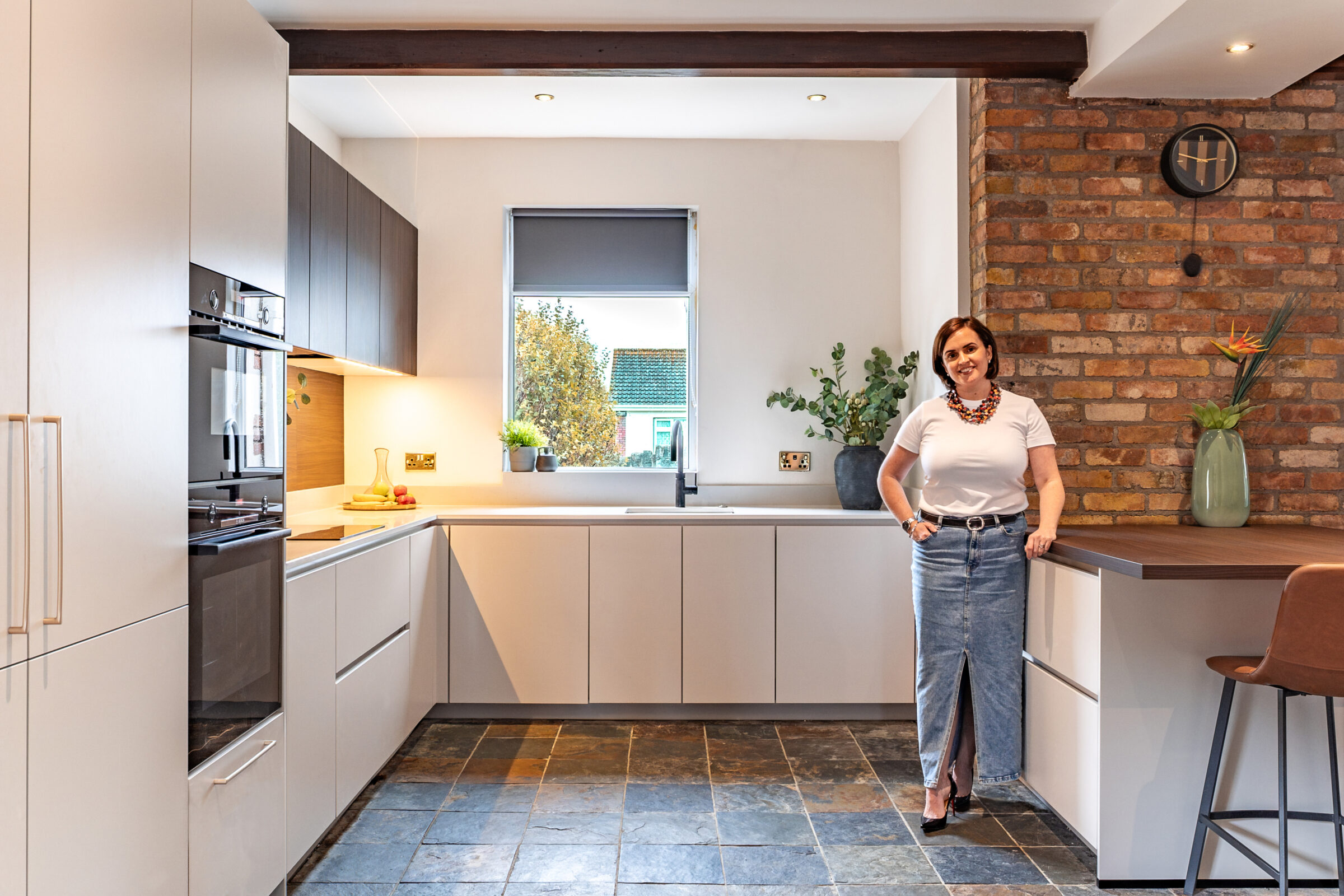
Light-on-light gives a fresh, minimalist look using white, cream, or pale greige cabinets alongside light oak, bleached wood, or pale stone flooring that reflects natural light around the room.
Light-on-light schemes benefit from added texture, such as wire-brushed wood, subtle stone veining, or a patterned backsplash, so the room doesn’t end up feeling flat or clinical.
Colour, Undertones, and Why the “Same Colour” Rarely Works
Instead of asking whether the floor and cabinets should be the same colour, it’s more useful to think in terms of undertones (warm versus cool) and tonal contrast (lighter or darker).
Matching a stained wood floor to wood cabinets in exactly the same shade often ends up looking dated and forced, because there’s no visual break for the eye to rest on.
A good target is at least two to three shades of difference between the floor and the cabinets, even when both are oak or walnut, to keep the look layered and intentional rather than accidental.
Undertones matter just as much as lightness: pairing warm floors, like honey oak or warm beige tile, with warm cabinets, such as almond, cream, or warm wood tones, reads very differently to mixing cool elements, like a cool grey floor with blue-grey or white cabinets, which gives a crisper feel.
It’s worth testing samples together, one cabinet door, one floor plank or tile, and a countertop sample, under your own kitchen’s lighting rather than relying on how they look on a screen.
Designing Around Detailed Floors vs Detailed Cabinets
Contrast doesn’t only apply to colour, it also applies to how busy or detailed each surface is. If the floor has a strong pattern, the cabinets usually need to be simpler, and vice versa.
Intricate flooring, such as herringbone, chevron, encaustic-style tiles, or bold geometric patterns, tends to look best with plain or classic cabinets in a solid, lighter or darker colour.
Modern, glossy, or highly detailed cabinet fronts, like slab acrylic, fluted doors, or strong colours, pair better with simpler, more uniform floors such as wide-plank wood or large-format stone tiles.
It helps to decide upfront where you want the eye to go first, the floor or the cabinets, and keep the other element quieter in both colour and pattern.
As a general principle, aim for one statement element per “layer” of the room (floor, cabinets, countertop), and let undertones and contrast tie everything together instead of letting several features compete for attention.
Practical Pros and Cons: Living With Light vs Dark Kitchen Floors
Beyond aesthetics, day-to-day maintenance, pets, kids, and how often you cook should all weigh heavily on whether you choose light or dark flooring.
- Light floors: the benefits include a space that feels larger, better reflection of natural light, and dust or light pet hair that’s less noticeable. The drawbacks are that darker spills, scuffs, and deep grime lines tend to show up more clearly.
- Dark floors: the benefits include a cosy, dramatic look and the ability to hide some stains and general wear. The drawbacks are that dust, footprints, and lighter crumbs or pet fur show up more, especially under bright lighting.
Material examples at the lighter end include light oak LVP, pale porcelain, and light stone; at the darker end, think dark walnut, espresso-stained engineered wood, and charcoal concrete-look tile.
If neither extreme appeals, mid-tone “bridge” options, like mid-greige planks or lightly patterned stone, work with both lighter and darker cabinets and don’t show every speck of dirt. For a fuller comparison of materials, including how each performs for water resistance, durability, and cost, our guide on what type of flooring is best for a kitchen covers tile, vinyl, hardwood, laminate, and stone in more detail.
How to Decide: A Simple Step-by-Step Process
- Assess your natural light and orientation – south- versus north-facing, the number and size of windows, and whether you have glass doors or skylights.
- Decide what you want to highlight – the cabinets, the floor, or the countertops as the main focal point of the kitchen.
- Choose a direction – a lighter floor with darker cabinets, a darker floor with lighter cabinets, or a subtler mid-tone contrast for a softer, more blended look.
- Gather real samples – a cabinet door, floor planks or tiles, and a countertop piece – and view them together in your actual kitchen across morning, midday, and evening light.
- Double-check practical needs – kids, pets, cooking habits, and your cleaning routine – and adjust a shade lighter or darker if it makes everyday life easier.
If you’d rather compare materials in person than guess from swatches, visiting our kitchen showrooms Dublin location gives you full kitchen displays with cabinet and floor combinations already paired, which makes step four far easier to work through.
Frequently Asked Questions
Is it outdated to have dark kitchen cabinets with dark floors?
Dark-on-dark kitchens are still popular heading through 2024 to 2026, especially in modern and contemporary homes, but they look best when balanced with lighter countertops, backsplashes, and plenty of layered lighting.
Do light kitchen floors go with white cabinets, or is that too much white?
White or off-white cabinets with light floors are common and timeless, but the key is adding variation in texture and undertone, such as white shaker cabinets with light oak or pale greige wood-look floors, to avoid a sterile “all-white box” effect.
Should my kitchen flooring match the floors in the rest of my house?
Running the same or similar flooring through adjoining spaces often makes smaller homes feel bigger and more cohesive, but kitchen flooring also needs to be durable and moisture-resistant, so exact matching isn’t always necessary or practical.
What if my existing cabinets are an awkward mid-tone wood colour?
Going several shades lighter, such as a pale greige tile, or darker, such as a rich walnut or charcoal look, on the floor helps avoid a muddy, all mid-tone room. Updating hardware and wall colour can also help modernise dated wood tones.
Can I use the exact same colour for kitchen floor and cabinets if I change the finish?
It’s possible to use a similar colour if the textures are clearly different, for example matte wood cabinets with a glossy tile that’s close in tone, but most designers still recommend at least a small tonal shift to keep the design from feeling flat.