Choosing the right balance between flooring and worktops is one of the most influential design decisions in luxury modern kitchens, shaping how spacious, cohesive, and refined the room feels. Whether your kitchen floor should be lighter or darker than the countertop depends on light levels, layout, materials, and how you want the space to function day to day.
At Kube Interiors, this decision is rarely about following a fixed rule. Instead, it’s about understanding contrast, proportion, and how different surfaces interact within the overall kitchen design.
Why Floor and Countertop Contrast Matters
Flooring and countertops are two of the largest visual surfaces in a kitchen. Their relationship affects:
- How large or small the space feels
- How light moves around the room
- Whether cabinetry feels grounded or heavy
- How easily the kitchen transitions into adjoining spaces
A well-balanced contrast helps guide the eye naturally through the room, while poor contrast can make even a high-quality kitchen feel visually disjointed.
When a Lighter Floor Works Best
A lighter kitchen floor paired with a darker countertop is one of the most popular combinations in contemporary homes.
Benefits of a lighter floor
- Reflects more natural and artificial light
- Makes smaller kitchens feel more open
- Creates a clean, airy foundation for cabinetry
- Works exceptionally well in apartments and urban homes
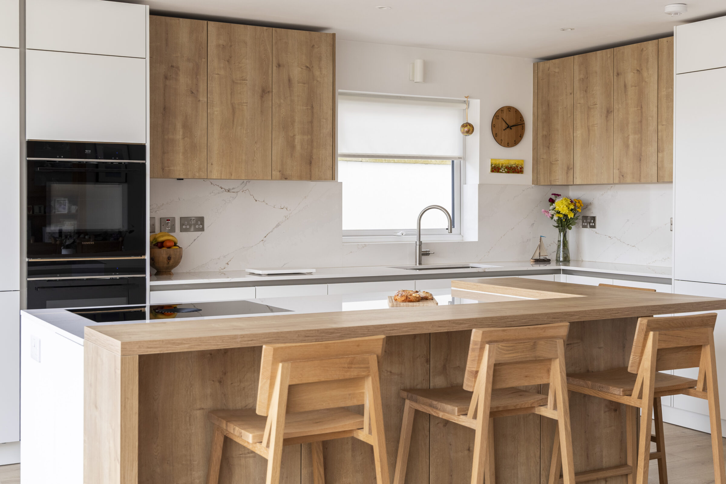
Light floors such as pale porcelain tiles, light oak engineered wood, or soft stone-effect finishes help anchor darker worktops without overwhelming the space. This approach is especially effective in kitchens with limited daylight or compact footprints.
From a practical standpoint, lighter floors also show less dust than very dark flooring, though spills may be more visible depending on finish.
When a Darker Floor Makes Sense
A darker kitchen floor can be striking, sophisticated, and highly effective in the right setting.
Benefits of a darker floor
- Grounds the kitchen visually
- Adds drama and depth
- Works beautifully in open-plan spaces
- Hides minor stains and wear more easily
Dark floors pair particularly well with lighter countertops in large kitchens, where there is enough natural light to prevent the space from feeling heavy. Charcoal tiles, dark-stained engineered wood, or concrete-effect porcelain are often used to create a strong architectural base.
Darker flooring also works well when the kitchen flows into living or dining areas with similarly toned floors, helping maintain visual continuity across the home.
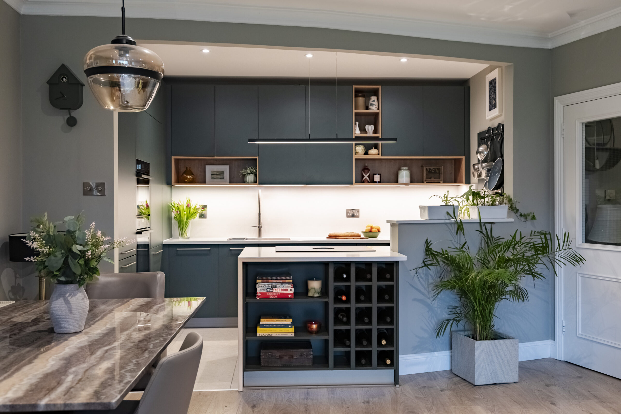
Matching Flooring and Countertops in Open-Plan Kitchens
Open-plan layouts require extra consideration, as the kitchen floor is rarely contained to one room.
In these spaces, flooring often runs continuously through the kitchen, dining, and living areas. The countertop colour then becomes the main contrast point rather than the floor.
In luxury modern kitchens, designers often choose:
- Mid-tone floors that sit between light and dark
- Countertops that contrast cabinetry rather than flooring
- Subtle textures instead of bold colour shifts
This approach avoids harsh transitions and helps the kitchen feel like part of a unified living space rather than a separate zone.
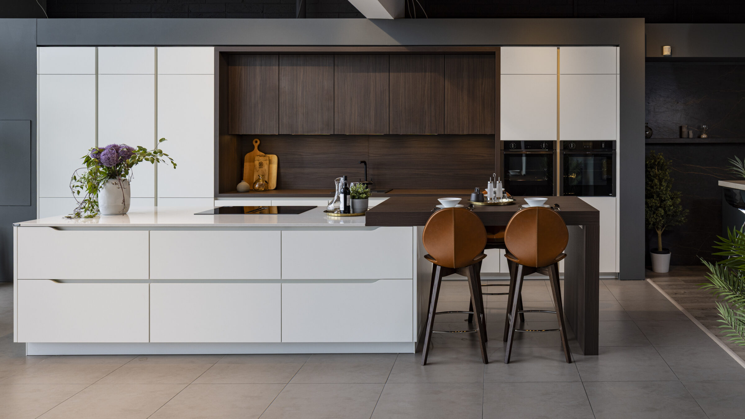
Should the Floor or Countertop Be the Darkest Element?
A useful design guideline is to limit very dark tones to one major surface.
If both the floor and countertop are dark, the kitchen can feel visually compressed unless the room is large and well lit. Conversely, making both surfaces very light can sometimes result in a flat or clinical look.
A balanced hierarchy usually works best:
- One dark element (floor or countertop)
- One lighter element to provide contrast
- Mid-tones introduced through cabinetry, walls, or splashbacks
This hierarchy helps the eye move comfortably through the space.
Practical Considerations Beyond Colour
While aesthetics are important, practicality should also influence the decision.
Maintenance
- Dark floors hide marks better but show dust more easily
- Light floors show spills but disguise everyday debris
- Polished worktops show fingerprints more than matt finishes
Wear and longevity
- High-contrast schemes can highlight wear over time
- Subtle tonal differences age more gracefully
- Textured finishes are more forgiving than flat, glossy ones
Lighting
Artificial lighting temperature plays a role. Warm lighting softens contrast, while cool lighting increases it. Always view samples under your actual kitchen lighting before committing.
Popular Floor and Countertop Combinations
Some combinations consistently perform well in both design and practicality:
- Light stone-effect floor + dark quartz countertop
- Mid-tone wood floor + light ceramic or porcelain worktop
- Dark porcelain floor + pale marble-effect surface
- Neutral grey floor + warm-toned composite countertop
These pairings offer contrast without overpowering the room.
How to Decide What’s Right for Your Kitchen
Ask yourself:
- How much natural light does the kitchen receive?
- Is the space compact or expansive?
- Does the floor extend into other rooms?
- Do you want the worktop or the cabinetry to be the focal point?
Testing samples together — floor, worktop, and cabinetry — in the actual space is the most reliable way to make the right choice.
A well-balanced contrast between kitchen flooring and countertops creates a space that feels cohesive, comfortable, and visually timeless.
When deciding whether your kitchen floor should be lighter or darker than your countertop, prioritise balance over rules. The most successful kitchens use contrast deliberately, guided by light, layout, and how the space is lived in every day.