Kitchen colour trends shift a little every year, but 2026 marks a clearer move away from the cool, stark palettes that dominated recent kitchen design toward something warmer and more lived-in. This guide covers the shades leading the way, how they’re being used on cabinets and walls, and how to choose a palette that won’t feel dated again in a few years.
Key Takeaways
- 2026’s most popular kitchen colour is a family of warm earthy neutrals – taupe, mushroom, clay and stone – often layered with soft greens and wood.
- Butter yellow shifts to a gentle accent rather than the main kitchen colour, while deep blues, burgundies and chocolate browns add drama in smaller doses.
- Kitchen colour trends in 2026 are warmer, softer and more nature-inspired than 2025, with earthy tones, natural timber and open shelving leading the look.
- Multifunctional kitchens favour calm, versatile colour palettes that work for cooking, working, and entertaining in one open-plan space.
- This guide walks through 2026 colour palettes, cabinet ideas, and practical tips for choosing a long-lasting kitchen colour scheme.
What Is the Most Popular Kitchen Colour in 2026?
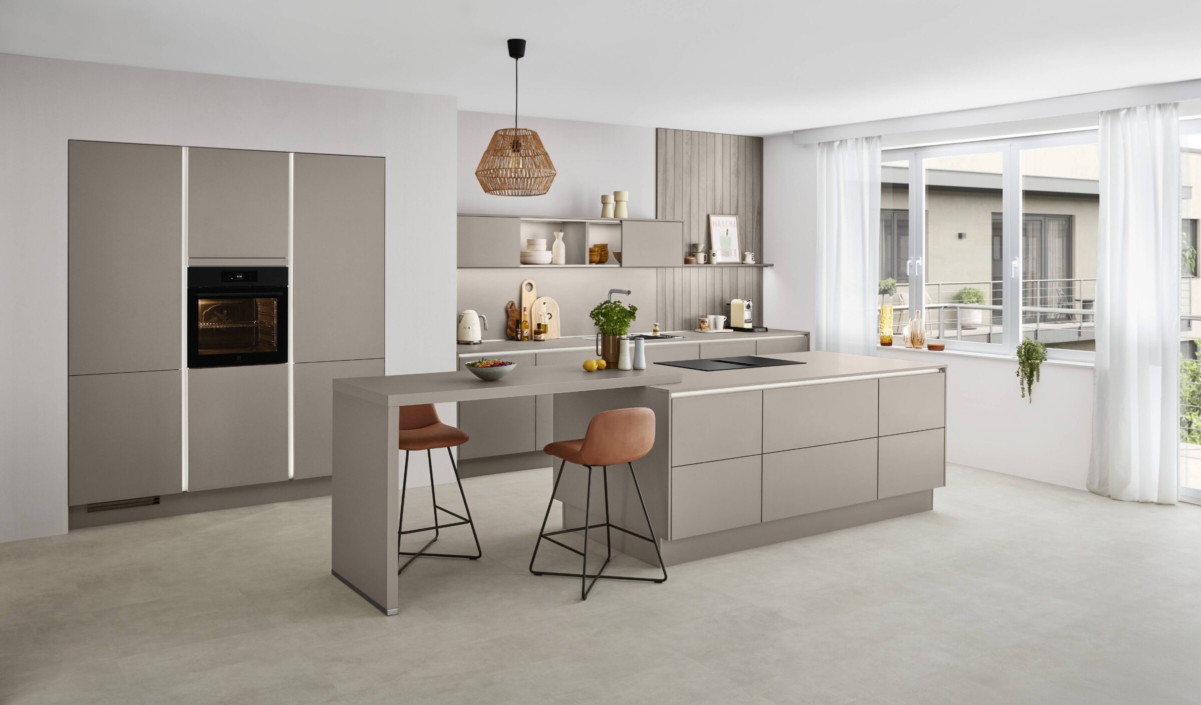
Warm earthy neutrals, mushroom, taupe, oat, and soft clay, are the defining kitchen colour for 2026, overtaking the cool greys and bright whites that led the previous few years.
These shades are used mainly on cabinets and walls, and are most often paired with light oak or walnut alongside warm metal hardware such as brushed brass or bronze.
This “not-white” neutral family works just as well in small apartments as in large open-plan homes, and it holds up under both natural daylight and warm artificial lighting in the evening.
Compared with 2025, the shift is fairly clear: stark white and pale, blue-toned grey are giving way to softer, moodier, more nature-led colour palettes.
A typical 2026 kitchen combines a warm neutral base with one accent colour, often a muted green, a deep blue, burgundy, or butter yellow, to give the room some character without overwhelming it.
Kitchen Colour Trends: From 2025 into 2026
This section summarises how kitchen colour has evolved over the past year or so into the look that’s now defining 2026.
The clearest shift is away from crisp white and blue-toned grey toward mineral-inspired neutrals such as putty, stone, flint and mushroom. Kitchen design in 2026 is heavily influenced by wider interior design ideas around comfort, sustainability, and long-term use rather than chasing a single trend colour.
Kitchens are increasingly treated as social living spaces rather than purely functional rooms, so colour schemes now prioritise a cosy, lived-in warmth over a showroom-style gloss finish.
Designers often talk about “grounded” palettes: earthy tones, natural timber, tactile stone, and soft, layered lighting, in place of the high contrast and shine that defined kitchens a few years ago.
Warm Neutrals and Earthy Tones: The New Foundations
Warm neutrals, including taupe, mushroom, stone, oat, greige, and warm porcelain off-whites, form the main foundation for 2026 kitchen colour.
These shades are typically used across full runs of cabinets, walls, and occasionally ceilings, creating a cocooning feel that suits multifunctional spaces used for cooking, working, and socialising.
A common way to layer warm neutrals is mushroom base cabinets, stone-toned walls, and pale cream open shelving or a range hood, building depth without introducing a second strong colour.
Deeper earthy tones, such as clay, sand, terracotta, and soft brown, work well as anchors on islands, pantries, or tall storage units, giving the room some weight without tipping into a dark, heavy scheme.
Matte paint, brushed metals, honed stone worktops, and subtle veining tend to flatter these warm tones far more than glossy, high-contrast finishes.
Nature-Led Greens and Smoky Jades
Green remains one of the most important kitchen colours for 2026, but it has softened considerably from the dark emerald of a few years ago toward smoky, eucalyptus, sage and moss tones.
“Smoky jade” and other grounded greens now function almost as a new neutral, often used on lower cabinets or islands with warmer neutral uppers above them.
Concrete pairings include sage units with light oak open shelving, smoky jade with quartz worktops, or olive tones alongside fluted glass cabinet fronts.
These greens suit interior design schemes that aim to connect indoors with nature, especially in kitchens with plenty of natural light and some planting nearby.
Green is also used more subtly as an accent, on the back of open shelving, inside glass-fronted cabinets, or as a continuous splashback behind a range cooker.
Depth and Drama: Indigo Blues, Burgundy and Chocolate Browns
Alongside the warm neutrals, 2026 kitchen colour trends also celebrate richer tones: deep indigo, midnight blue, burgundy, aubergine, and chocolate brown.
Indigo or midnight blue is commonly used on islands, base cabinets, larders, or a single feature wall, giving a tailored, confident feel without the severity of pure black.
Burgundy and wine-red shades work well as statement choices for home bars, breakfast stations, or glass-fronted cupboards, especially when paired with brass hardware and warm lighting.
Chocolate brown and espresso have become something of a new “dark neutral” for cabinetry, grounding a space while pairing comfortably with cream, mushroom, and butter yellow accents.
These darker, moodier palettes work best with layered lighting, natural textures, and lighter stone or timber elsewhere in the room, to avoid the space feeling too heavy overall.
Butter Yellow and Muted Pastels: Gentle 2026 Accents
Butter yellow is a key accent colour for 2026, but it’s a softer, sun-washed, chalky version rather than a bold, primary yellow.
Practical uses include a butter yellow pantry door, a bar area, a run of open shelving, or a breakfast nook set within an otherwise neutral kitchen colour scheme.
Muted pastels such as blush, dusty rose, putty pink, and stone blue also appear as small touches, on stools, pendant lights, or the inside of open shelving, rather than across whole walls.
In 2026, these lighter shades are rarely used for full cabinet runs; they tend to work better as secondary colours that add a bit of joy and warmth without dominating the room.
Butter yellow and soft pastels pair especially well with earthy tones, light oak, and linen textures, supporting the cosy, layered look that defines much of this year’s interior design direction.
Stained Wood, Walnut and Natural Timber Tones
Stained wood cabinetry has become central to 2026 kitchen trends, in many cases replacing all-white kitchens entirely rather than just accenting them.
Light-stained oak suits Scandinavian-inspired, airy spaces, while mid- to dark-toned walnut leans into a richer, more cocooning feel.
Many designs now mix natural timber with painted cabinets, for example, a walnut island paired with mushroom-toned perimeter cabinetry, rather than committing to wood or paint across the whole room.
Timber also shows up on open shelving, slatted details, and fluted panels, adding texture and depth alongside an otherwise restrained colour palette.
Natural wood tones reinforce the broader move toward earthy colours, helping the overall kitchen feel timeless and rooted in real materials rather than following one passing trend.
Soft Monochrome and Layered Tonal Palettes
Softened monochrome is an evolution of the classic black-and-white kitchen, built instead from warm greys, off-whites, and charcoal rather than stark contrast.
Tone-on-tone schemes layer two or three shades from the same colour family across cabinets, walls, and splashbacks, giving depth without introducing a second distinct colour.
Examples include warm linen uppers with mushroom lowers, or two closely related green tones split between the base units and a panelled island.
These layered, tonal palettes create a calm, cohesive look that suits multifunctional, open-plan rooms particularly well.
Hardware, stone veining, and subtle pattern play on tiles or textiles can all add extra visual interest without breaking the soft monochrome effect.
Kitchen Colour in the Context of Wider 2026 Kitchen Trends
Kitchen colour choices in 2026 are closely linked to broader kitchen design trends and how the room is actually used day to day.
Warm earthy tones connect directly to the rise of warm minimalism, a focus on fewer, better materials, natural stone, and softly sculptural forms rather than a maximal mix of finishes.
Open shelving, glass-fronted cabinets, and bespoke home bars all influence where colour gets placed, generally encouraging feature tones on the areas meant to be seen and admired.
Curved edges, fluted glass, and statement stone worktops tend to read more clearly against softer, grounded kitchen colour palettes than against high-contrast schemes.
As islands increasingly become multifunctional hubs for dining, working, and cooking, colour is also used to zone the space, for example, a darker island set against lighter surrounding cabinetry, or the reverse.
How to Choose the Right Kitchen Colour Palette for 2026
Start by assessing your kitchen’s natural light, room orientation, and any existing finishes you plan to keep before committing to a colour palette.
From there, it generally works best to choose a warm neutral or timber base for the main cabinets, then add one or two accent colours for depth and personality.
Testing large paint or material samples on-site, and looking at them at different times of day, shows how a colour genuinely shifts in your own kitchen’s light rather than how it looks on a small swatch or a screen.
Matching the palette to your personal style matters too, whether that’s calm, stone-toned minimalism or a bolder burgundy or indigo statement.
It’s worth keeping permanent elements, cabinets, worktops, and flooring, in timeless, earthy tones, and saving accessories or smaller surfaces for any trend-driven colours you want to experiment with. Since flooring is one of the most expensive and longest-lasting choices in the room, our guide on what type of flooring is best for a kitchen is worth reading alongside this one, since it covers which materials pair well with these warmer 2026 colour schemes.
If you’d rather see large samples of cabinetry, worktops, and flooring together in person before deciding, our kitchen showrooms Dublin location lets you compare these 2026 palettes against real materials and lighting rather than guessing from photos.
Using Colour with Open Shelving and Display Areas
Open shelving remains a prominent 2026 kitchen trend, and it gives homeowners an extra opportunity to introduce colour without committing to a full cabinet run.
One popular approach is painting the wall behind the open shelving in a deeper shade, sage, smoky jade, clay, or butter yellow, while keeping the shelves and surrounding cabinets neutral.
Curating crockery, glassware, and cookbooks within a tighter colour palette also helps reinforce the overall kitchen colour scheme rather than letting the shelving look cluttered.
Glass-fronted cabinets and fluted glass doors can showcase accent colours on the back panels or interior surfaces for a more subtle version of the same effect.
Whatever you choose for open shelving, it should coordinate with the nearby worktops, splashbacks, and metal finishes so the room reads as one considered scheme rather than several disconnected choices.
Multi Functional Kitchens: Colour for Work, Cooking and Socialising
Many 2026 kitchens serve as genuinely multifunctional spaces for cooking, home working, and entertaining, so the colour scheme needs to support several different activities at once.
Calm, grounded colours on the main cabinets and walls help reduce visual noise on busy days, which matters more in a room that’s in near-constant use.
Colour can also be used to zone the space: a darker island for social and prep activity, a slightly different neutral around a built-in desk area, or a richer tone on a dedicated bar cabinet.
Colour interacts closely with lighting too; warm neutrals and earthy tones tend to look especially good under dimmed evening lighting, which suits a kitchen that doubles as an entertaining space.
It’s worth planning colour alongside storage, seating, and technology placement together, so the kitchen feels coherent whatever mode it’s being used in at the time.
Colours to Move Away From if You Want a Future-Proof 2026 Kitchen
This section is mainly for readers who are renovating now and want their kitchen colour to still feel current well beyond 2026.
It’s worth dialling back on cool, blue-based greys and stark white-on-white schemes, both of which can feel cold and dated next to the warmer trends now taking over.
Very bright, saturated emerald greens and classic navy are also giving way to softer greens and warmer indigo or inky tones.
Strong, lemony yellows are less favoured than the buttery, mellow tones discussed earlier, mainly because they blend more comfortably with earthy palettes.
More broadly, it’s worth shifting away from high-gloss finishes and extreme contrasts toward matte or low-sheen surfaces and gentler, more layered colour transitions.
Frequently Asked Questions
Is white completely out of fashion for kitchens in 2026?
Pure, bright white is less dominant than it once was, but soft off-whites and warm porcelain tones are still widely used as part of a layered neutral palette. Using white in warmer, creamier versions, and combining it with stone, timber, and brass, helps avoid a clinical look. White is now more often a supporting colour, on walls, ceilings, or trims, rather than the only cabinet shade in the room.
Can I use bold colours in a small kitchen without making it feel cramped?
Rich colours such as deep blue, smoky jade, or chocolate brown can work very well in small kitchens, provided they’re balanced with light worktops and good lighting. Using bold colour on the lower cabinets or a single feature wall, while keeping the upper cabinets and ceiling lighter, helps open the space up. Keeping finishes matte and avoiding too many competing shades also matters more in compact rooms than larger ones.
What kitchen cabinet colour is best for resale value in 2026?
Warm neutrals, mushroom, taupe, stone, and soft off-white, along with light-stained wood, are generally the safest choices for broad appeal. Adding personality through easily changed elements, like a bar area, open shelving, or paintable walls, is usually a better strategy than committing to a bold colour on permanent cabinetry. Buyers in 2026 tend to favour kitchens that feel warm, grounded, and adaptable rather than highly specific or very dark schemes throughout.
How do I mix painted cabinets with wood without clashing colours?
The easiest approach is to choose a warm neutral or soft green paint that echoes the undertone of the timber you’re using, whether that’s warm, cool, or red-based. Light oak tends to pair well with mushroom or stone, mid walnut with a creamy off-white, and darker walnut with clay or butter yellow accents. It’s worth sampling both the wood and the paint together under the same lighting before making a final decision.
Should my kitchen colour match the rest of my home’s interior design?
The colours don’t need to be identical, but they should feel related so the transition between rooms feels smooth rather than jarring. Repeating at least one element, a timber tone, a metal finish, or the main neutral, from adjacent spaces is a simple way to tie the kitchen into the rest of the home. Using a consistent, warm, earthy base palette throughout the house is one of the easiest ways to make the kitchen feel integrated and intentional rather than separate from everything else.